Sharif Labban • UX Portfolio

THE PRODUCT SPECTRUM (SIDEKICK TO THE PERSONA SPECTRUM)
You are NOT the user... and you also don't have their devices!
The root of the essential UX mantra You ≠ User is grounded in a phenomenon which psychologists call the false consensus effect (1). This extremely common cognitive bias refers to “the tendency to assume that one’s own opinions, beliefs, attributes, or behaviors are more widely shared than is actually the case” (2). When I asked Perplexity to explain this to an 8-year-old, it responded, “a person might believe everyone else agrees with them, even if that’s not true.” You – like me, and like everyone else in the world – probably come across this bias in our own thinking multiple times a day. It’s just another one of those pesky quirks in how we humans operate.
Stupendous, so what? When this effect occurs in the process of software development, specifically when a team is making thousands of decisions to produce a digital product, assuming your end users will think and act the same way you do is a recipe for friction and confusion. The false consensus effect is why UX designers rely on an array of tools and tactics to assess how well designs are fit for use in the real world: by actual people who are not them.
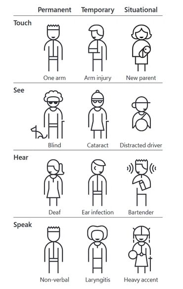
Microsoft’s Inclusive Design Principles (3) contain a wealth of resources to help keep these types of biases in check while designing both digital and non-digital solutions. A powerful concept introduced in the Inclusive 101 Guidebook is The Persona Spectrum, “a quick tool to help foster empathy and show how a solution scales to a broader audience” (4).

I’ve long found The Persona Spectrum to be thought-provoking and especially useful early in the UX design process. As a broad framework, it can also serve as a great input for user research, product strategy, and generally keeping perspective on the intended value of solutions within the bigger, real-world picture. Tools like The Persona Spectrum help us keep the false consensus effect at bay in the beginning. But then comes implementation...
In my experience as a UXer, there’s a critical point in every design project where the team mentally “turns the corner” and we narrow the focus squarely within the world of digital design to bring the solution to life in code. This is also the point in the process where the false consensus effect can start to creep back into the team’s thinking: critiquing screen flows on our own phones, scrutinizing layouts and micro-animations in stunning Retina display, or debating the usability of a mobile UI rendered enormously on a Smartboard in a glorious corporate high-rise.
This is when I’ve found myself dreaming up a similar type of spectrum tailored for use as a reference during the digital Product / UI design process, which can provide value during front-end development, QA, and post-market analysis as well.
So, I created this product-focused sidekick (Robin) to accompany the person-focused spectrum from Microsoft (Batman).

The Product Spectrum is all about meeting users where they are in the real world - with bad network connections, cracked phones, and distracted minds. Like The Persona Spectrum, The Product Spectrum is also intended as a quick tool to spark empathy and ultimately avoid the pitfalls of the false consensus effect while developing digital products and services. Over the typical months of implementation after an empathy-soaked discovery phase, it can become progressively easier to lose sight of just how much you may differ from your end users (especially if you’re in the trenches of software-production mayhem and feeling the pressures of just getting the thing out the door).
But now, with Batman and Robin united in full force, we can more readily design for inclusivity both in terms of the person, as well as the devices they can access. For example:
- While sketching task flows or the navigation through your product, you might glance at The Product Spectrum and ask, “what’s the recovery path if there’s an unlucky network blip while the user is on the confirmation page?” Or even better, “if the user lacks reliable network connection and is unable to complete the transaction online at all, what can they do instead?”
- To stress test the information hierarchy and layout of your most important screens, you could ask, “is the priority content findable even if the user is resolute in tolerating their busted phone (like me 🤦♂️) and sees an elaborate spiderweb of cracks all over your beautiful UI?”
- Or to be extra-considerate about visual accessibility, you should ask, “how do these color contrast ratios fare if the user’s device is in low battery mode?”
Staying mindful about our natural biases like the false consensus effect – this universal misconception that other people will experience things and behave in the same way that we do – from product conceptualization through deployment and into post-launch analysis is what UX design mentality is all about.
As a designer, or anyone who contributes to producing digital solutions, the more your team prepares for not only who will stop by to use your product on their journey, but also what sort of devices they’ll show up with, the better you’ll mitigate the many risks of users encountering poor UX. Your solutions will be designed to enable users to get the job done, despite the chaotic circumstances all around us.
So, what do you think: is your product designed for use by people in the real world?
***
Hero image (pun intended) made in Stable Diffusion.
(1) https://www.nngroup.com/articles/false-consensus/
(2) https://dictionary.apa.org/false-consensus-effect
(3) https://inclusive.microsoft.design/
(4) https://inclusive.microsoft.design/tools-and-activities/Inclusive101Guidebook.pdf
Published on CPU Time on February 27, 2024.
Labban CV v6 (pdf)
DownloadSharif Labban • UX Designer • Music Composer
Copyright © 2025 Sharif Labban - All Rights Reserved.
Powered by GoDaddy Website Builder